Introduction to MatplotLab - Python
introml.analyticsdojo.com
17. MatplotLab
This has been adopted from the IPython notebook available at http://github.com/jrjohansson/scientific-python-lectures.
17.1. Introduction
Matplotlib is a 2D and 3D graphics library for generating scientific figures.
Easy to get started
Support for \(\LaTeX\) formatted labels and texts
Great control of every element in a figure, including figure size and DPI.
High-quality output in many formats, including PNG, PDF, SVG, EPS, and PGF.
GUI for interactively exploring figures and support for headless generation of figure files (useful for batch jobs).
More information at the Matplotlib web page: http://matplotlib.org/
17.2. Using matplotlib with Jupyter
%matplotlib inlineensures that visuals will be provided in a notebook rather than opening a new image.Import matplotlab. It is a common package and has already been installed.
Import the matplotlib.pyplot module under the name plt.
# This is not strictly for a Python rather.
%matplotlib inline
import matplotlib
import matplotlib.pyplot as plt
17.3. matplotlib Library
Objects that one can apply functions and actions on, and no object or program states should be global.
Created figure instance in the
figvariable.And from it we create a new axis instance
axesusing theadd_axesmethod in theFigureclass instancefig.
#This generates the x and y variables we will be plotting.
import numpy as np
x = np.linspace(0, 5, 10)
y = x ** 2
#This initiates the Figure.
fig = plt.figure()

#This creates the size of the figure  [left, bottom, width, height (range 0 to 1)]
axes = fig.add_axes([0, 0, .75, .75])

#This creates a x, y, and the color of the graph
axes.plot(x, y, 'blue')
axes.set_xlabel('X Axis')
axes.set_ylabel('Y Azis')
axes.set_title('Title');
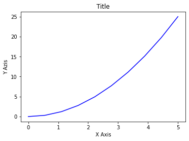
fig = plt.figure()

#This creates the size of the figure  [left, bottom, width, height (range 0 to 1)]
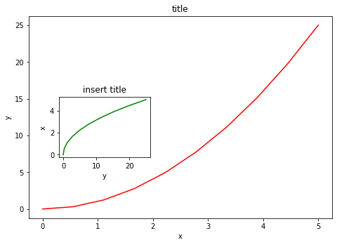
axes1 = fig.add_axes([0, 0, 1, 1]) # main axes
axes1.plot(x, y, 'red')
axes1.set_xlabel('x')
axes1.set_ylabel('y')
axes1.set_title('title')

#This creates the size of the figure  [left, bottom, width, height (range 0 to 1)]
axes2 = fig.add_axes([0.1, 0.3, 0.3, 0.3]) # inset axes
axes2.plot(y, x, 'green')
axes2.set_xlabel('y')
axes2.set_ylabel('x')
axes2.set_title('insert title');
17.4. Subplots
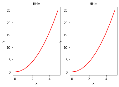
If we don’t care about being explicit about where our plot axes are placed in the figure canvas, then we can use one of the many axis layout managers in matplotlib.
Subplots can be used to list multiple related plots.
fig, axes = plt.subplots(nrows=1, ncols=2)

for ax in axes:
    ax.plot(x, y, 'r')
    ax.set_xlabel('x')
    ax.set_ylabel('y')
    ax.set_title('title')
17.5. Figure size, Aspect Ratio and DPI
Matplotlib allows the aspect ratio, DPI and figure size to be specified when the
Figureobject is created using thefigsizeanddpikeyword arguments.figsizeis a tuple of the width and height of the figure in inches, anddpiis the dots-per-inch (pixel per inch).To create an 800x400 pixel, 100 dots-per-inch figure, we can do:
fig = plt.figure(figsize=(8,4), dpi=100)
<Figure size 800x400 with 0 Axes>
The same arguments can also be passed to layout managers, such as the subplots function:
fig, axes = plt.subplots(figsize=(12,3))

axes.plot(x, y, 'r')
axes.set_xlabel('x')
axes.set_ylabel('y')
axes.set_title('title');

17.6. Saving Figures
To save a figure to a file we can use the
savefigmethod in theFigureclass.Here we can also optionally specify the DPI and choose between different output formats.
fig.savefig("filename.png")
fig.savefig("filename.png", dpi=200)
17.7. Legends
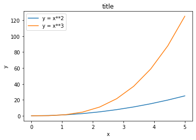
Legends for curves in a figure can be added with the
legend.The legend function takes an optional keyword argument loc that can be used to specify where in the figure the legend is to be drawn
Use the label=”label text” keyword argument when plots or other objects are added to the figure.
See http://matplotlib.org/users/legend_guide.html#legend-location for more details.
The following adjust the location:
ax.legend(loc=0) # let matplotlib decide the optimal location
ax.legend(loc=1) # upper right corner
ax.legend(loc=2) # upper left corner
ax.legend(loc=3) # lower left corner
ax.legend(loc=4) # lower right corner```
fig, ax = plt.subplots()

ax.plot(x, x**2, label="y = x**2")
ax.plot(x, x**3, label="y = x**3")
ax.legend(loc=2); # upper left corner
ax.set_xlabel('x')
ax.set_ylabel('y')
ax.set_title('title');
17.8. Formatting Text: LaTeX, Fontsize, Font Family
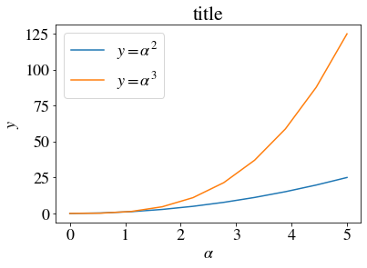
Matplotlib has great support for LaTeX. All we need to do is to use dollar signs encapsulate LaTeX in any text (legend, title, label, etc.). For example, “\(y=x^3\)”.
We can also change the global font size and font family, which applies to all text elements in a figure (tick labels, axis labels and titles, legends, etc.).
# Update the matplotlib configuration parameters:
matplotlib.rcParams.update({'font.size': 18, 'font.family': 'STIXGeneral', 'mathtext.fontset': 'stix'})
#matplotlib.rcParams.update({'font.size': 18, 'font.family': 'serif'})
fig, ax = plt.subplots()

ax.plot(x, x**2, label=r"$y = \alpha^2$")
ax.plot(x, x**3, label=r"$y = \alpha^3$")
ax.legend(loc=2) # upper left corner
ax.set_xlabel(r'$\alpha$')
ax.set_ylabel(r'$y$')
ax.set_title('title');
17.9. Formatting Colors, Linewidths, and Linetypes
We can use the MATLAB-like syntax where ‘b’ means blue… -‘b.-‘ means a blue line with dots. -‘g–’ means a green line with dashed lines.
# MATLAB style line color and style
ax.plot(x, x**2, 'b.-') # blue line with dots
ax.plot(x, x**3, 'g--') # green dashed line
[<matplotlib.lines.Line2D at 0x7f538c949978>]
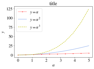
We can also define colors by their names or RGB hex codes and optionally provide an alpha value using the color and alpha keyword arguments:
fig, ax = plt.subplots()
ax.plot(x, x, 'r.-', label=r"$y = \alpha$",  alpha=0.5) #
ax.plot(x, x**2, label=r"$y = \alpha^2$", color="#1155dd", alpha=0.5)
ax.plot(x, x**3, 'y--', label=r"$y = \alpha^3$", ) # green dashed line
ax.legend(loc=2) # upper left corner
ax.set_xlabel(r'$\alpha$')
ax.set_ylabel(r'$y$')
ax.set_title('title');
17.10. Linewidth
To change the line width, we can use the
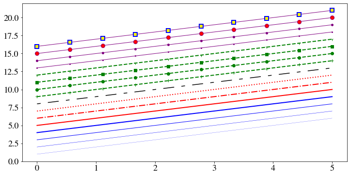
linewidthorlwkeyword argument. The line style can be selected using thelinestyleorlskeyword arguments:
fig, ax = plt.subplots(figsize=(12,6))

ax.plot(x, x+1, color="blue", linewidth=0.25)
ax.plot(x, x+2, color="blue", linewidth=0.50)
ax.plot(x, x+3, color="blue", linewidth=1.00)
ax.plot(x, x+4, color="blue", linewidth=2.00)

# possible linestype options ‘-‘, ‘--’, ‘-.’, ‘:’, ‘steps’
ax.plot(x, x+5, color="red", lw=2, linestyle='-')
ax.plot(x, x+6, color="red", lw=2, ls='-.')
ax.plot(x, x+7, color="red", lw=2, ls=':')

# custom dash
line, = ax.plot(x, x+8, color="black", lw=1.50)
line.set_dashes([5, 10, 15, 10]) # format: line length, space length, ...

# possible marker symbols: marker = '+', 'o', '*', 's', ',', '.', '1', '2', '3', '4', ...
ax.plot(x, x+ 9, color="green", lw=2, ls='--', marker='+')
ax.plot(x, x+10, color="green", lw=2, ls='--', marker='o')
ax.plot(x, x+11, color="green", lw=2, ls='--', marker='s')
ax.plot(x, x+12, color="green", lw=2, ls='--', marker='1')

# marker size and color
ax.plot(x, x+13, color="purple", lw=1, ls='-', marker='o', markersize=2)
ax.plot(x, x+14, color="purple", lw=1, ls='-', marker='o', markersize=4)
ax.plot(x, x+15, color="purple", lw=1, ls='-', marker='o', markersize=8, markerfacecolor="red")
ax.plot(x, x+16, color="purple", lw=1, ls='-', marker='s', markersize=8,
        markerfacecolor="yellow", markeredgewidth=2, markeredgecolor="blue");
17.11. Control Over Axis Appearance
The appearance of the axes is an important aspect of a figure that we often need to modify to make a publication quality graphics. We need to be able to control where the ticks and labels are placed, modify the font size and possibly the labels used on the axes. In this section we will look at controling those properties in a matplotlib figure.
17.11.1. Plot range
17.12. Control Over Axis Appearance
Configure ranges of the axes with
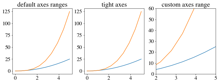
set_ylimandset_xlimmethods oraxis('tight')for automatrically getting “tightly fitted” axes ranges.
fig, axes = plt.subplots(1, 3, figsize=(12, 4))

axes[0].plot(x, x**2, x, x**3)
axes[0].set_title("default axes ranges")

axes[1].plot(x, x**2, x, x**3)
axes[1].axis('tight')
axes[1].set_title("tight axes")

axes[2].plot(x, x**2, x, x**3)
axes[2].set_ylim([0, 60])
axes[2].set_xlim([2, 5])
axes[2].set_title("custom axes range");
17.12.1. Logarithmic scale
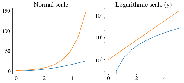
It is also possible to set a logarithmic scale for one or both axes.
Each of the axes’ scales are set seperately using
set_xscaleandset_yscalemethods which accept one parameter (with the value “log” in this case):
fig, axes = plt.subplots(1, 2, figsize=(10,4))
axes[0].plot(x, x**2, x, np.exp(x))
axes[0].set_title("Normal scale")

axes[1].plot(x, x**2, x, np.exp(x))
axes[1].set_yscale("log")
axes[1].set_title("Logarithmic scale (y)");
17.13. Other 2D plot styles
‘scatter`
stepbarFor more see http://matplotlib.org/gallery.html.
n = np.array([0,1,2,3,4,5])
n = np.array([0,1,2,3,4,5])
fig, axes = plt.subplots(1, 3, figsize=(12,3))

axes[0].scatter(n, n + 0.25*np.random.randn(len(n)))
axes[0].set_title("scatter")

axes[1].step(n, n**2, lw=2)
axes[1].set_title("step")

axes[2].bar(n, n**2, align="center", width=0.5, alpha=0.5)
axes[2].set_title("bar")
Text(0.5, 1.0, 'bar')

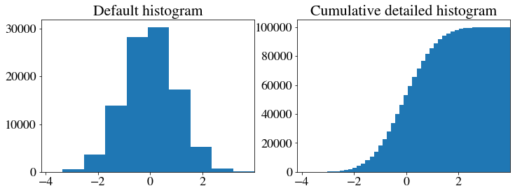
# A histogram
n = np.random.randn(100000)
fig, axes = plt.subplots(1, 2, figsize=(12,4))

axes[0].hist(n)
axes[0].set_title("Default histogram")
axes[0].set_xlim((min(n), max(n)))

axes[1].hist(n, cumulative=True, bins=50)
axes[1].set_title("Cumulative detailed histogram")
axes[1].set_xlim((min(n), max(n)));
Copyright AnalyticsDojo 2016. This work is licensed under the Creative Commons Attribution 4.0 International license agreement
This has been adopted from the IPython notebook available at http://github.com/jrjohansson/scientific-python-lectures by J.R. Johansson.

